.svg)
With the profile design in Lemontaps, you can centrally manage the appearance of your digital business cards and adapt it to your corporate design.
This feature is only available for administrators and only in paid plans.
This ensures that all profiles have a consistent look, present themselves professionally, and can be used optimally for lead capture.
What elements can I customize?
Note: You can configure all settings specifically for units by selecting the unit under “Choose unit” where you want to apply the design. This allows you, for example, to use a different logo and design for subsidiaries.

1. Box shape
-
Round
-
Square
2. Font
Learn how to customize the font here:
Explanation and guide
3. Colors
1. Button colors:
- “Save contact”: color of the “Save contact” and “Connect now” buttons
- Files: color of the “File” boxes
- Generic website link: color of the generic website button
- Text color: color of the main text on the profile
- Border color: color of frames and lines on profile elements
- Page background: background color of the profile page
- Card background: background color of the content cards on the profile
- Dashed border: color of the dashed line to the left of the name (if enabled)
- Footer text color: color of the text in the profile footer

4. Images
You can define the following images:- Cover images
- Profile image (avatar shown by default if no profile image is set)
- Logos
| Default image |
This image is displayed by default on all profiles unless a different image is already set for an individual profile. In that case, the default image will not be applied.
|
| Templates (additional images) | End users can choose from these, provided that the Roles & Permissions allow image editing. They will not be able to upload their own images. Additional images can only be defined for cover images (section 6) and logos (section 7), not for profile images. |
Images can be uploaded as .jpg, .png, or .jpeg. The dimensions are as follows:
| Cover images |
Aspect ratio: 16:9 |
| Default profile image | Aspect ratio: 1:1 Recommended minimum resolution: 600 px per side The image is displayed as a circle |
| Logos | Recommended minimum resolution (shorter side): 3000 px |
4.6 Custom favicon
-
A favicon is the small icon representing a website in the browser. You can use a custom favicon so your logo is shown instead of the Lemontaps logo.

-
Aspect ratio: 1:1
-
Recommended resolution: 16x16 px
-
Upload your default favicon by placing a .ico or .png file in the designated area. The file size can be up to 1 MB.
5. Box order
- About me
- My contact details
- My links
- My files
- Team directory
- Contact form

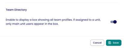
6. Team directory
The team directory in Lemontaps’ digital business card displays all employees of a company in one place and makes them easily discoverable. This allows contacts not only to save a single person but also to browse the entire team and find additional contacts.- If a profile is assigned to a unit, only profiles from the main unit are shown.
- If a profile is not assigned to any unit, all profiles are shown.
- If "10. Team Directory" is enabled in the profile design, it will be displayed on all profiles using that design.
If you want a profile to display only the members of a specific unit in the Team Directory, please ensure the following:
- The profile on which the Team Directory should display the unit members must belong to the same unit.
- The Team Directory feature must be enabled for that profile. You can do this by going to Edit Profile → Team Directory.
7. Contact form
You have the following options:
- Show/hide form
- Display as popup (the contact form automatically appears as a popup when opening the digital business card profile. Even if dismissed, it remains visible on the profile)
8. Contact details box

You can choose between:
- Show only the first X attributes by default (you can define the number)
- Show all attributes by default
9. Position of default links
Default links are links that are always displayed for all employees or specific units. You can configure their position here:
- Either before individual links
- or after individual links
10. Position of default files
- Either before individual files
- or after individual files
11. Footer
- Link to your legal notice (imprint)
- Link to your privacy policy
You can also translate the footer and provide different links for different languages here.
12. Additional settings
12.1 Name suffix connector
Example:
| Option | Display |
| Comma | Max Mustermann, LL.M. |
| Space | Max Mustermann LL.M. |
| Colon | Max Mustermann: Attorney |
| Line break | Max Mustermann MBA |
12.2 Automatically trigger vCard download
- On desktop and Android, the profile opens and the download starts simultaneously.
- On iPhone, the contact opens automatically and can be added to the address book. Use the toggle to enable or disable this setting.
| desktop/Android | iPhone |
12.3 Show dashed border (left)
If enabled, a dashed line appears to the left of the name.

13. Advanced customization with custom CSS
This allows you to:
- Customize layouts individually
- Adjust spacing
- Define additional design rules
Frequently asked questions
No, the design is managed centrally via the unit.